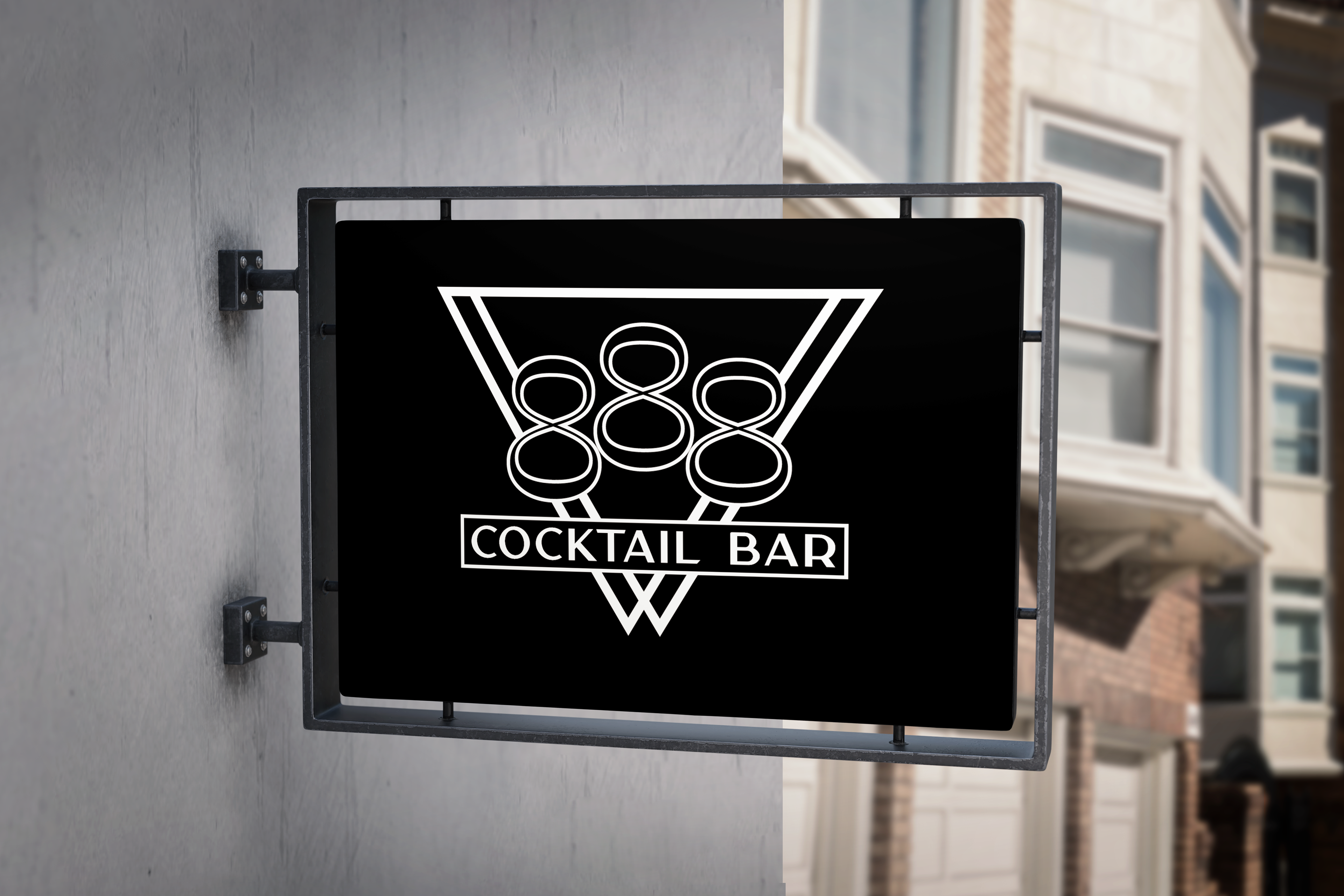
Client: 888 Cocktail Bar
Project: Logo Design & Brand Identity
Project: Logo Design & Brand Identity
Overview:
888 Cocktail Bar is a contemporary gathering spot known for its craft cocktails made with locally sourced ingredients and its creative, health-conscious food offerings. The brand aims to foster a friendly, inclusive atmosphere where guests can relax, socialize, and enjoy high-quality drinks and dishes in a modern setting.
888 Cocktail Bar is a contemporary gathering spot known for its craft cocktails made with locally sourced ingredients and its creative, health-conscious food offerings. The brand aims to foster a friendly, inclusive atmosphere where guests can relax, socialize, and enjoy high-quality drinks and dishes in a modern setting.
Challenge:
The bar needed a logo that conveyed both sophistication and approachability—modern in style, yet warm and inviting. The design had to be in black and white, with black as the dominant color, to ensure strong contrast and visual impact across signage, menus, and merchandise.
The bar needed a logo that conveyed both sophistication and approachability—modern in style, yet warm and inviting. The design had to be in black and white, with black as the dominant color, to ensure strong contrast and visual impact across signage, menus, and merchandise.
Solution:
The final logo features a clean, modern aesthetic that balances simplicity with meaning. Triangular shapes subtly suggest a martini glass, nodding to the cocktail experience at the heart of the brand. The "888" typography is arranged to evoke a sense of community and togetherness, symbolizing people coming together. The black-and-white color scheme reinforces the brand’s bold, upscale identity while ensuring excellent legibility across various applications.
The final logo features a clean, modern aesthetic that balances simplicity with meaning. Triangular shapes subtly suggest a martini glass, nodding to the cocktail experience at the heart of the brand. The "888" typography is arranged to evoke a sense of community and togetherness, symbolizing people coming together. The black-and-white color scheme reinforces the brand’s bold, upscale identity while ensuring excellent legibility across various applications.
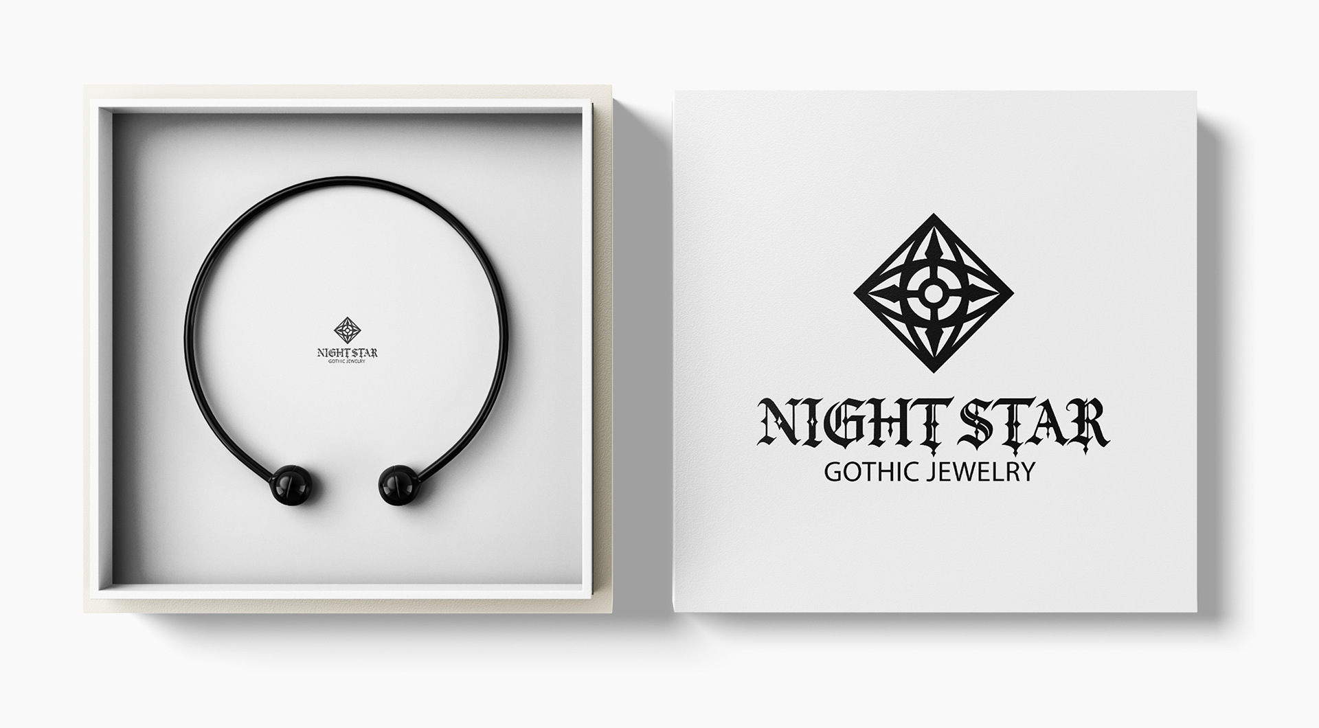
Client: Night Star Gothic Jewelry
Project: Logo Design & Brand Identity
Project: Logo Design & Brand Identity
Overview:
Night Star Gothic Jewelry is a brand specializing in gothic-inspired jewelry that appeals to men and women immersed in the punk and goth subcultures. They sought a logo that would serve as a strong visual cornerstone for their brand, balancing modern design trends with the dark, elegant motifs central to their aesthetic.
Night Star Gothic Jewelry is a brand specializing in gothic-inspired jewelry that appeals to men and women immersed in the punk and goth subcultures. They sought a logo that would serve as a strong visual cornerstone for their brand, balancing modern design trends with the dark, elegant motifs central to their aesthetic.
Challenge:
The company needed a distinctive logo that felt contemporary yet deeply rooted in gothic style. It was essential that the design resonate with their niche audience while maintaining versatility and clarity across various uses.
The company needed a distinctive logo that felt contemporary yet deeply rooted in gothic style. It was essential that the design resonate with their niche audience while maintaining versatility and clarity across various uses.
Solution:
The final logo design fuses modern aesthetics with gothic influences. An abstract gemstone shape forms the core of the mark, accentuated by subtle wrought iron-inspired details to evoke a gothic atmosphere. Typography combines a decorative font with a clean sans-serif, striking a balance between drama and readability. This ensures the logo remains impactful and legible across all applications.
The final logo design fuses modern aesthetics with gothic influences. An abstract gemstone shape forms the core of the mark, accentuated by subtle wrought iron-inspired details to evoke a gothic atmosphere. Typography combines a decorative font with a clean sans-serif, striking a balance between drama and readability. This ensures the logo remains impactful and legible across all applications.
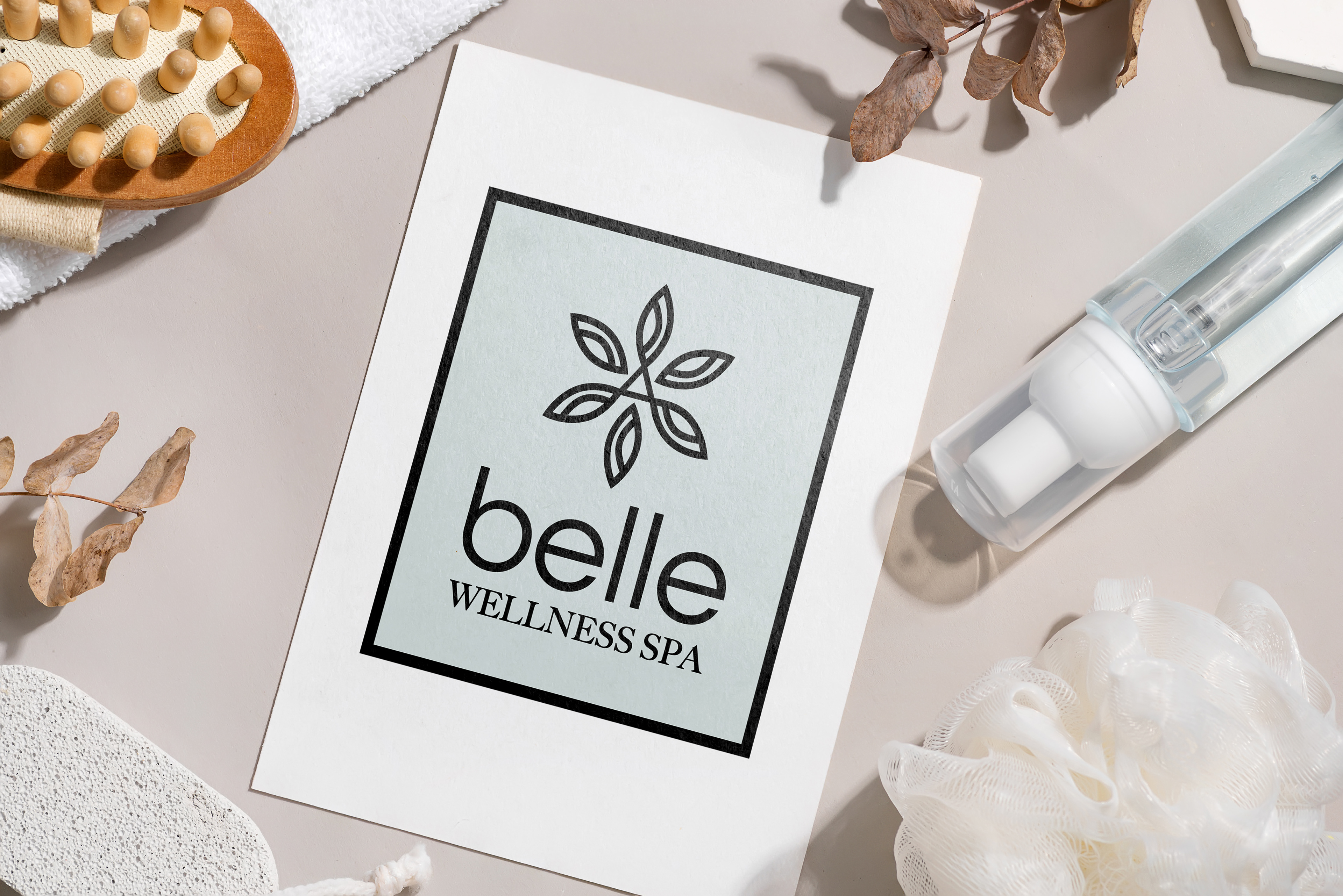
Client: Belle Wellness Spa
Project: Logo Design
Project: Logo Design
Overview:
Belle Wellness Spa is a health and wellness brand dedicated to providing natural, plant-based self-care treatments tailored primarily for women. They sought a logo that would visually capture the essence of softness, tranquility, and holistic wellness, reflecting their commitment to calming and restorative experiences.
Belle Wellness Spa is a health and wellness brand dedicated to providing natural, plant-based self-care treatments tailored primarily for women. They sought a logo that would visually capture the essence of softness, tranquility, and holistic wellness, reflecting their commitment to calming and restorative experiences.
Challenge:
The spa needed a logo design that embodied fluidity and serenity, resonating deeply with their target audience of health-conscious women seeking natural self-care. The design had to convey both elegance and approachability while aligning with the brand’s focus on nature and wellness.
The spa needed a logo design that embodied fluidity and serenity, resonating deeply with their target audience of health-conscious women seeking natural self-care. The design had to convey both elegance and approachability while aligning with the brand’s focus on nature and wellness.
Solution:
The final logo features a delicate floral symbol, representing the spa’s use of natural, plant-based ingredients. It is set against a soft, muted green background to evoke calmness and tranquility. The design successfully communicates the brand’s soothing, holistic approach and appeals strongly to its wellness-focused clientele.
The final logo features a delicate floral symbol, representing the spa’s use of natural, plant-based ingredients. It is set against a soft, muted green background to evoke calmness and tranquility. The design successfully communicates the brand’s soothing, holistic approach and appeals strongly to its wellness-focused clientele.
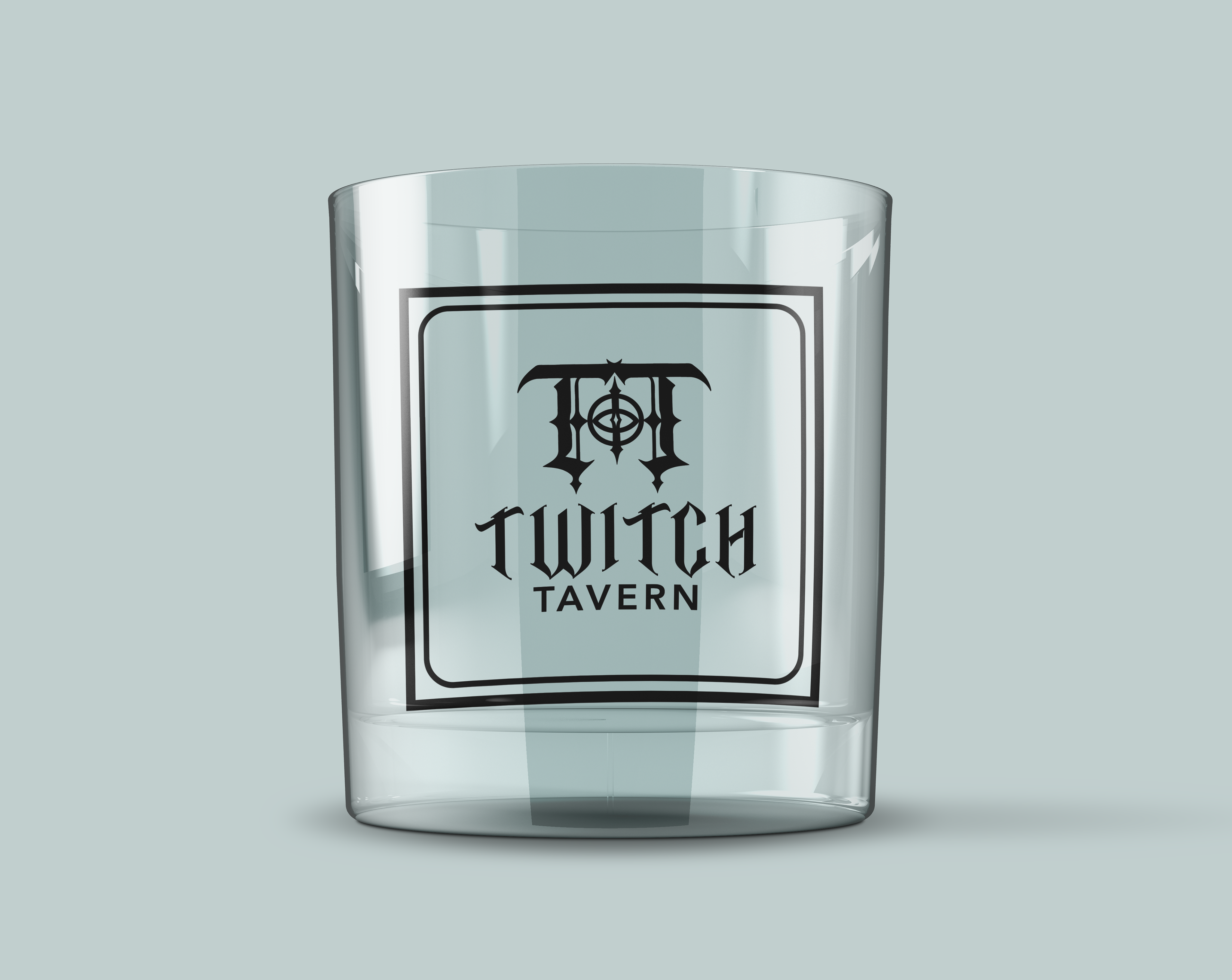
Client: Twitch Tavern
Project: Logo Design
Project: Logo Design
Overview:
Twitch Tavern is a unique establishment specializing in craft cocktails and featuring a punk/gothic music atmosphere. Targeting a mature audience with an appreciation for alternative culture, the tavern sought a logo that would visually represent its edgy vibe while remaining approachable and legible.
Twitch Tavern is a unique establishment specializing in craft cocktails and featuring a punk/gothic music atmosphere. Targeting a mature audience with an appreciation for alternative culture, the tavern sought a logo that would visually represent its edgy vibe while remaining approachable and legible.
Challenge:
The design needed to balance gothic stylistic elements with clear readability, ensuring it would appeal to patrons seeking a distinctive yet welcoming venue. Capturing the tavern’s identity as a gateway to an immersive, alternative experience was essential.
The design needed to balance gothic stylistic elements with clear readability, ensuring it would appeal to patrons seeking a distinctive yet welcoming venue. Capturing the tavern’s identity as a gateway to an immersive, alternative experience was essential.
Solution:
The final logo features a stylized double “T” arranged to resemble a doorway, symbolizing an invitation to step into another world. This concept combines gothic influences with clean, modern lines to create a design that reflects the tavern’s edgy aesthetic while maintaining strong legibility—perfectly embodying the client’s vision.
The final logo features a stylized double “T” arranged to resemble a doorway, symbolizing an invitation to step into another world. This concept combines gothic influences with clean, modern lines to create a design that reflects the tavern’s edgy aesthetic while maintaining strong legibility—perfectly embodying the client’s vision.
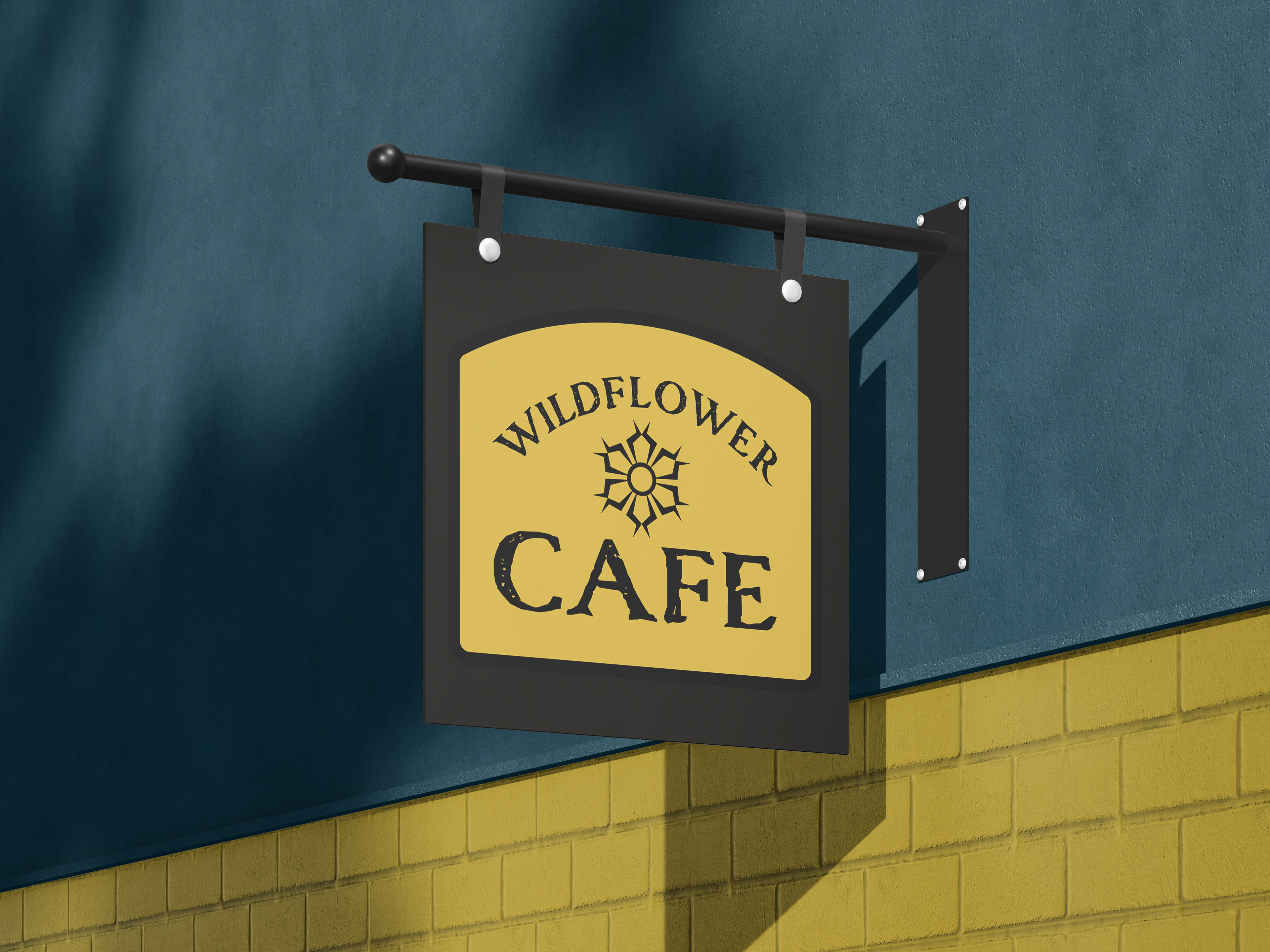
Client: Wildflower Café
Project: Logo Design
Project: Logo Design
Overview:
Wildflower Café is a family-friendly eatery known for its hearty, home-cooked meals and inviting atmosphere. The café required a logo that would become a core element of its brand identity, embodying warmth and simplicity to resonate with its target audience of families and casual diners.
Wildflower Café is a family-friendly eatery known for its hearty, home-cooked meals and inviting atmosphere. The café required a logo that would become a core element of its brand identity, embodying warmth and simplicity to resonate with its target audience of families and casual diners.
Challenge:
The logo needed to be versatile, working effectively across a range of applications—from large signage to small-scale items like menus and uniforms. It was essential for the design to convey a welcoming, cozy vibe that reflected the café’s approachable and rustic charm.
The logo needed to be versatile, working effectively across a range of applications—from large signage to small-scale items like menus and uniforms. It was essential for the design to convey a welcoming, cozy vibe that reflected the café’s approachable and rustic charm.
Solution:
The final logo features a cheerful yellow background that captures the warmth and comfort of the café’s interior. A simple, rustic-style font complements the brand’s friendly tone, while a minimalist flower icon ensures clarity and adaptability across various formats and uses.
The final logo features a cheerful yellow background that captures the warmth and comfort of the café’s interior. A simple, rustic-style font complements the brand’s friendly tone, while a minimalist flower icon ensures clarity and adaptability across various formats and uses.
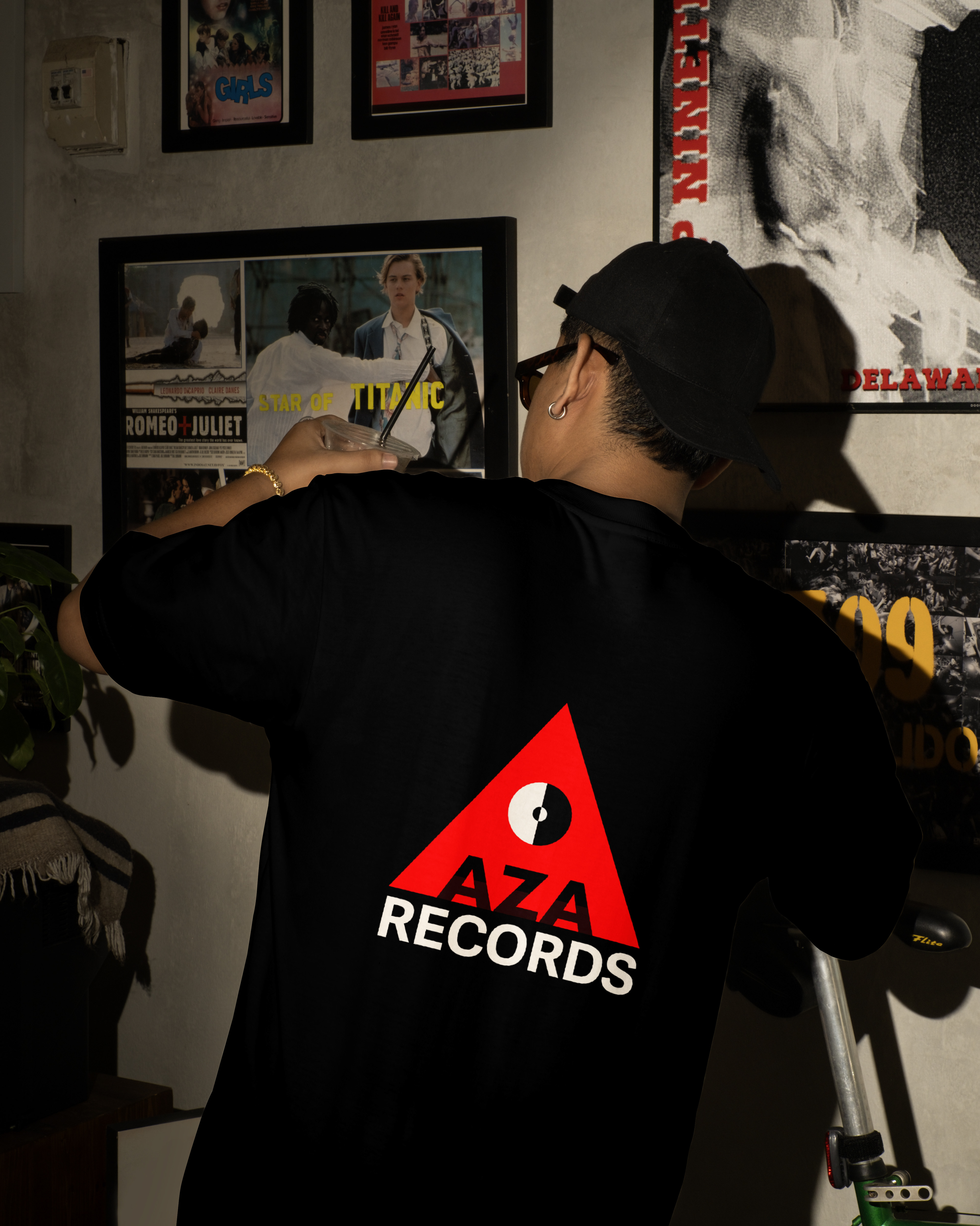
Client: Aza Records – Online Record Shop
Project: Logo Design
Project: Logo Design
Overview:
Aza Records is an online retailer specializing in electronic and hip hop vinyl records, catering to passionate music enthusiasts and collectors. They needed a bold, versatile logo that would establish a strong brand identity and resonate with their audience, while also being adaptable for merchandise and various digital platforms.
Aza Records is an online retailer specializing in electronic and hip hop vinyl records, catering to passionate music enthusiasts and collectors. They needed a bold, versatile logo that would establish a strong brand identity and resonate with their audience, while also being adaptable for merchandise and various digital platforms.
Challenge:
The logo design needed to incorporate the client’s specified color palette—red, black, and white—and appeal to a dynamic audience passionate about music culture and vinyl collecting. It was important for the logo to convey energy, ambition, and clarity across different applications, including apparel and packaging.
The logo design needed to incorporate the client’s specified color palette—red, black, and white—and appeal to a dynamic audience passionate about music culture and vinyl collecting. It was important for the logo to convey energy, ambition, and clarity across different applications, including apparel and packaging.
Solution:
The final logo features a striking interplay of red, black, and white to create high visual impact and brand recognition. A prominent upward-pointing triangle symbolizes growth and ambition, perfectly reflecting the brand’s energetic spirit. Clean, modern typography complements the symbol, ensuring readability and versatility across all mediums.
The final logo features a striking interplay of red, black, and white to create high visual impact and brand recognition. A prominent upward-pointing triangle symbolizes growth and ambition, perfectly reflecting the brand’s energetic spirit. Clean, modern typography complements the symbol, ensuring readability and versatility across all mediums.
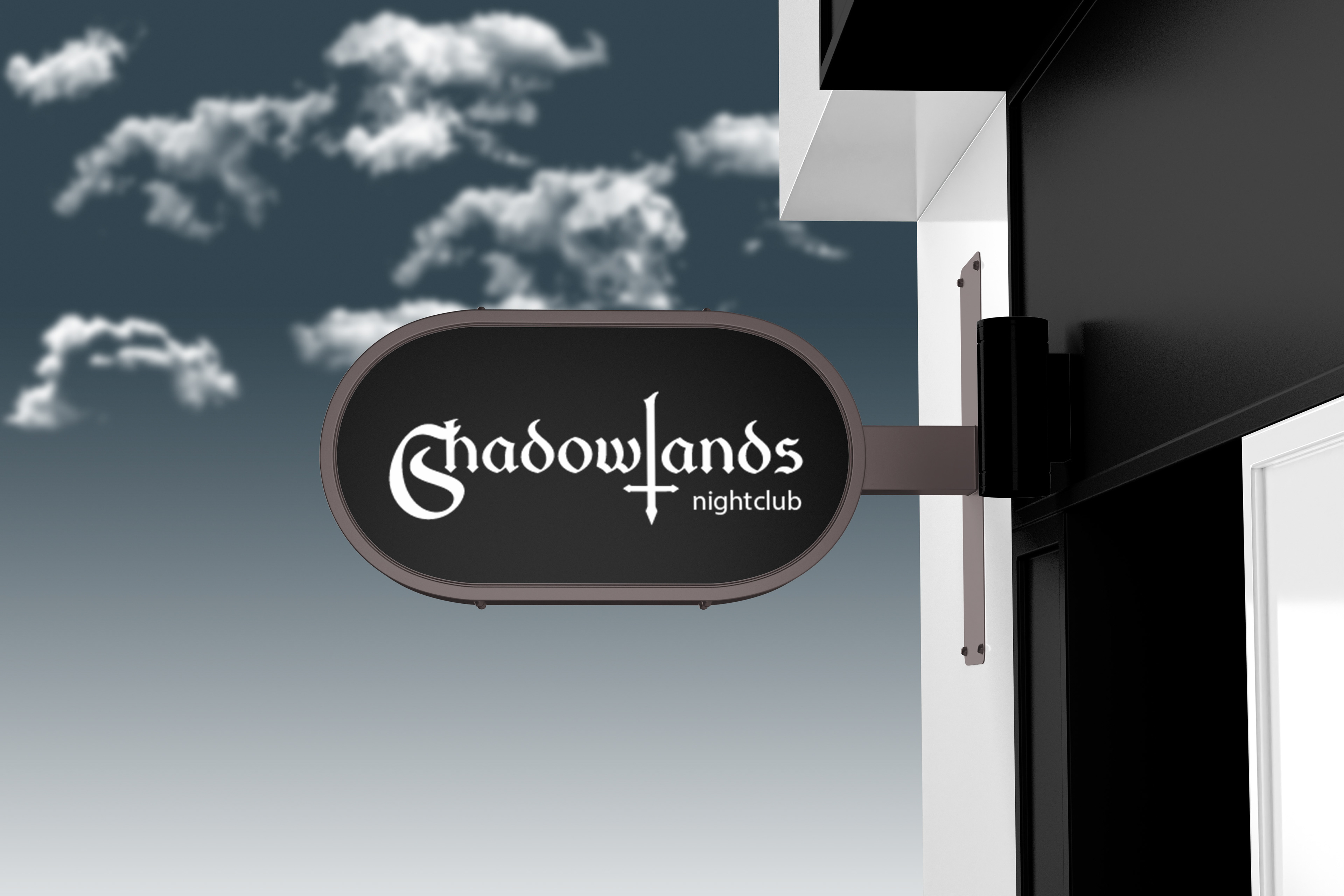
Client: Shadowlands Nightclub
Project: Logo Design
Project: Logo Design
Overview:
Shadowlands Nightclub is a new venue specializing in goth and industrial music, catering to an alternative subculture audience seeking an immersive, dark, and atmospheric nightlife experience. Ahead of its grand opening, the club required a distinctive logo that would visually establish its brand identity and reflect its unique musical and cultural focus.
Shadowlands Nightclub is a new venue specializing in goth and industrial music, catering to an alternative subculture audience seeking an immersive, dark, and atmospheric nightlife experience. Ahead of its grand opening, the club required a distinctive logo that would visually establish its brand identity and reflect its unique musical and cultural focus.
Challenge:
The logo needed to resonate strongly with the goth and industrial communities while maintaining clarity and versatility across different applications. A black background was requested to align with the club’s moody interior design, requiring careful font selection to ensure legibility without sacrificing the gothic aesthetic.
The logo needed to resonate strongly with the goth and industrial communities while maintaining clarity and versatility across different applications. A black background was requested to align with the club’s moody interior design, requiring careful font selection to ensure legibility without sacrificing the gothic aesthetic.
Solution:
The final design merges a decorative gothic-style typeface with a clean sans-serif font, achieving a balance between stylistic flair and readability. Set against a black background, the logo perfectly complements the club’s dark, immersive environment while effectively conveying its niche appeal.
The final design merges a decorative gothic-style typeface with a clean sans-serif font, achieving a balance between stylistic flair and readability. Set against a black background, the logo perfectly complements the club’s dark, immersive environment while effectively conveying its niche appeal.
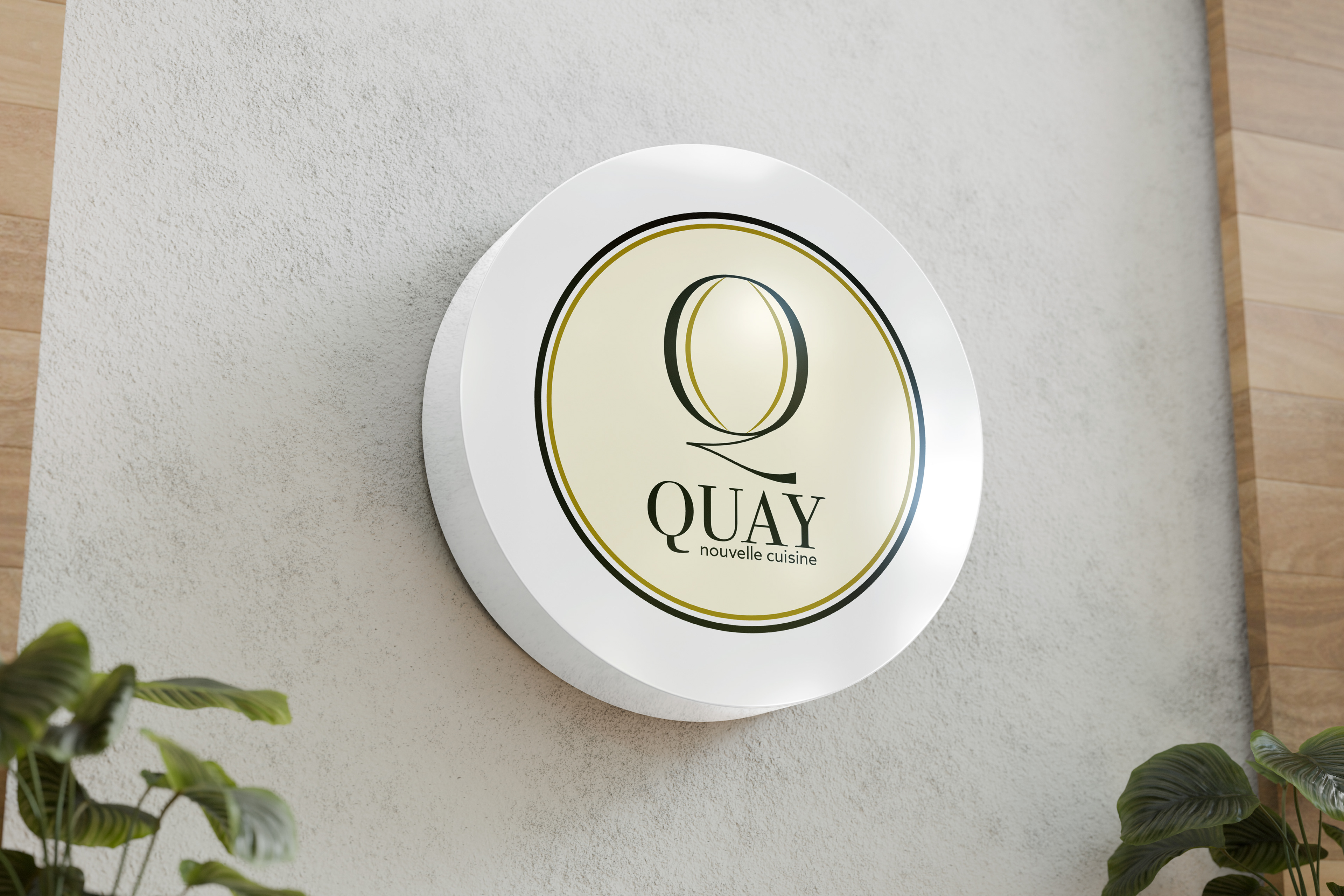
Client: Quay Nouvelle Cuisine
Project: Logo Design
Project: Logo Design
Overview:
Quay Nouvelle Cuisine is an upscale restaurant specializing in nouvelle cuisine, known for its elegant atmosphere and refined culinary offerings. The client sought a sophisticated logo to establish a strong brand identity that would visually reflect the restaurant’s luxurious dining experience and complement its carefully curated interior design.
Quay Nouvelle Cuisine is an upscale restaurant specializing in nouvelle cuisine, known for its elegant atmosphere and refined culinary offerings. The client sought a sophisticated logo to establish a strong brand identity that would visually reflect the restaurant’s luxurious dining experience and complement its carefully curated interior design.
Challenge:
The logo needed to convey elegance and luxury while integrating seamlessly with the restaurant’s cream-colored interior decor. It was important that the design resonate with an upscale clientele and reinforce the high-end positioning of the brand.
The logo needed to convey elegance and luxury while integrating seamlessly with the restaurant’s cream-colored interior decor. It was important that the design resonate with an upscale clientele and reinforce the high-end positioning of the brand.
Solution:
The final logo features an elegant monogram set against a cream background, creating a cohesive visual connection to the restaurant’s interior palette. The clean, refined design effectively communicates Quay’s commitment to style, quality, and an elevated dining experience.
The final logo features an elegant monogram set against a cream background, creating a cohesive visual connection to the restaurant’s interior palette. The clean, refined design effectively communicates Quay’s commitment to style, quality, and an elevated dining experience.