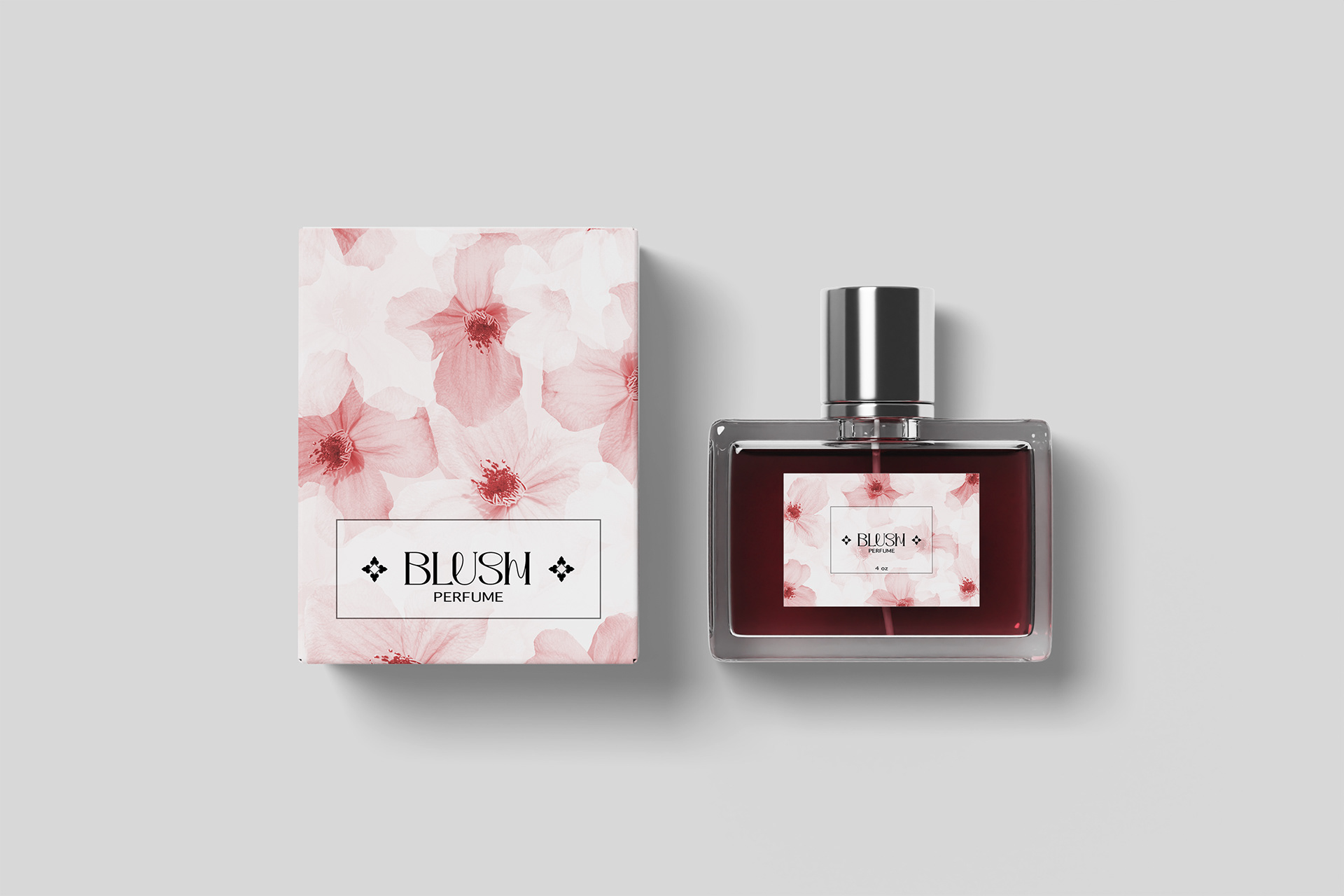
Client: Blush – High-End Fragrance Company
Project: Perfume Label & Box Packaging Design
Project: Perfume Label & Box Packaging Design
Overview:
Blush is a luxury fragrance brand known for its refined, feminine scents. For the launch of their new women’s perfume, they required packaging that would visually express the delicate and elegant essence of the fragrance while aligning with their upscale brand identity.
Blush is a luxury fragrance brand known for its refined, feminine scents. For the launch of their new women’s perfume, they required packaging that would visually express the delicate and elegant essence of the fragrance while aligning with their upscale brand identity.
Challenge:
The design needed to strike a balance between softness and sophistication. It was essential to incorporate a floral motif and a predominantly pink color palette to reflect the femininity of the scent, without compromising the premium feel of the brand.
The design needed to strike a balance between softness and sophistication. It was essential to incorporate a floral motif and a predominantly pink color palette to reflect the femininity of the scent, without compromising the premium feel of the brand.
Solution:
The final design features an intricate floral pattern rendered in varying shades of pink, creating a layered and elegant visual effect. The combination of soft hues and refined typography evokes a sense of delicacy and luxury, resulting in packaging that is both feminine and elevated—perfectly aligned with the Blush brand.
The final design features an intricate floral pattern rendered in varying shades of pink, creating a layered and elegant visual effect. The combination of soft hues and refined typography evokes a sense of delicacy and luxury, resulting in packaging that is both feminine and elevated—perfectly aligned with the Blush brand.
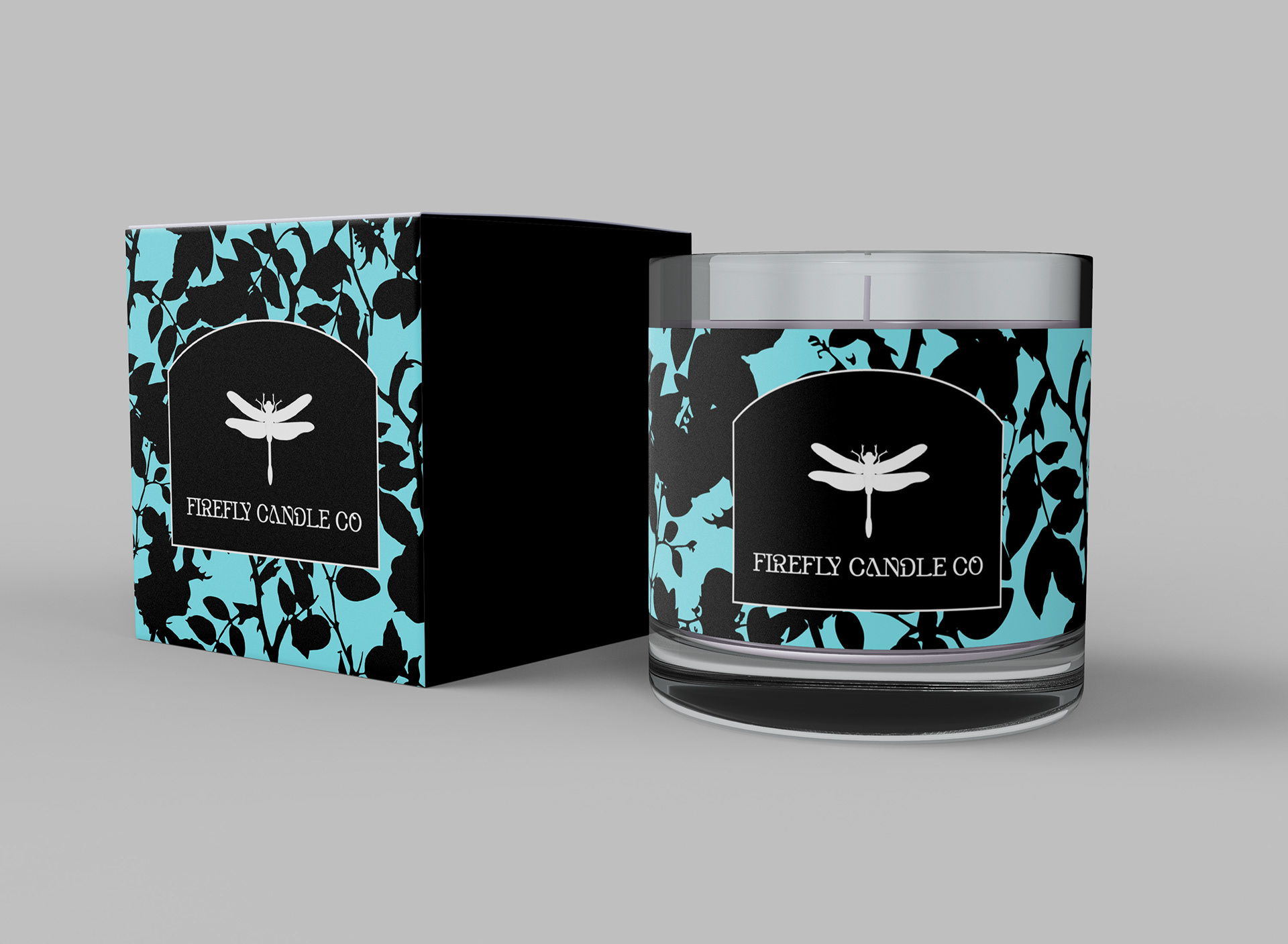
Client: Firefly Candle Co
Project: Label & Box Packaging Design
Project: Label & Box Packaging Design
Overview:
Firefly Candle Co specializes in soy-based candles crafted from natural ingredients. For their new product line, the company sought packaging that would communicate the purity of their materials while also evoking a calming and earthy aesthetic.
Firefly Candle Co specializes in soy-based candles crafted from natural ingredients. For their new product line, the company sought packaging that would communicate the purity of their materials while also evoking a calming and earthy aesthetic.
Challenge:
The packaging needed to reflect the brand’s commitment to natural ingredients while appealing to customers seeking relaxation and wellness. The design had to convey both the organic quality of the product and the tranquil experience it provides.
The packaging needed to reflect the brand’s commitment to natural ingredients while appealing to customers seeking relaxation and wellness. The design had to convey both the organic quality of the product and the tranquil experience it provides.
Solution:
The final design features a hand-drawn pattern of leaves and twigs, symbolizing the candle’s natural origins. A soothing teal color was chosen to promote feelings of calmness and serenity. Together, the organic pattern and soft palette create a cohesive and inviting look that aligns beautifully with Firefly Candle Co’s brand values.
The final design features a hand-drawn pattern of leaves and twigs, symbolizing the candle’s natural origins. A soothing teal color was chosen to promote feelings of calmness and serenity. Together, the organic pattern and soft palette create a cohesive and inviting look that aligns beautifully with Firefly Candle Co’s brand values.
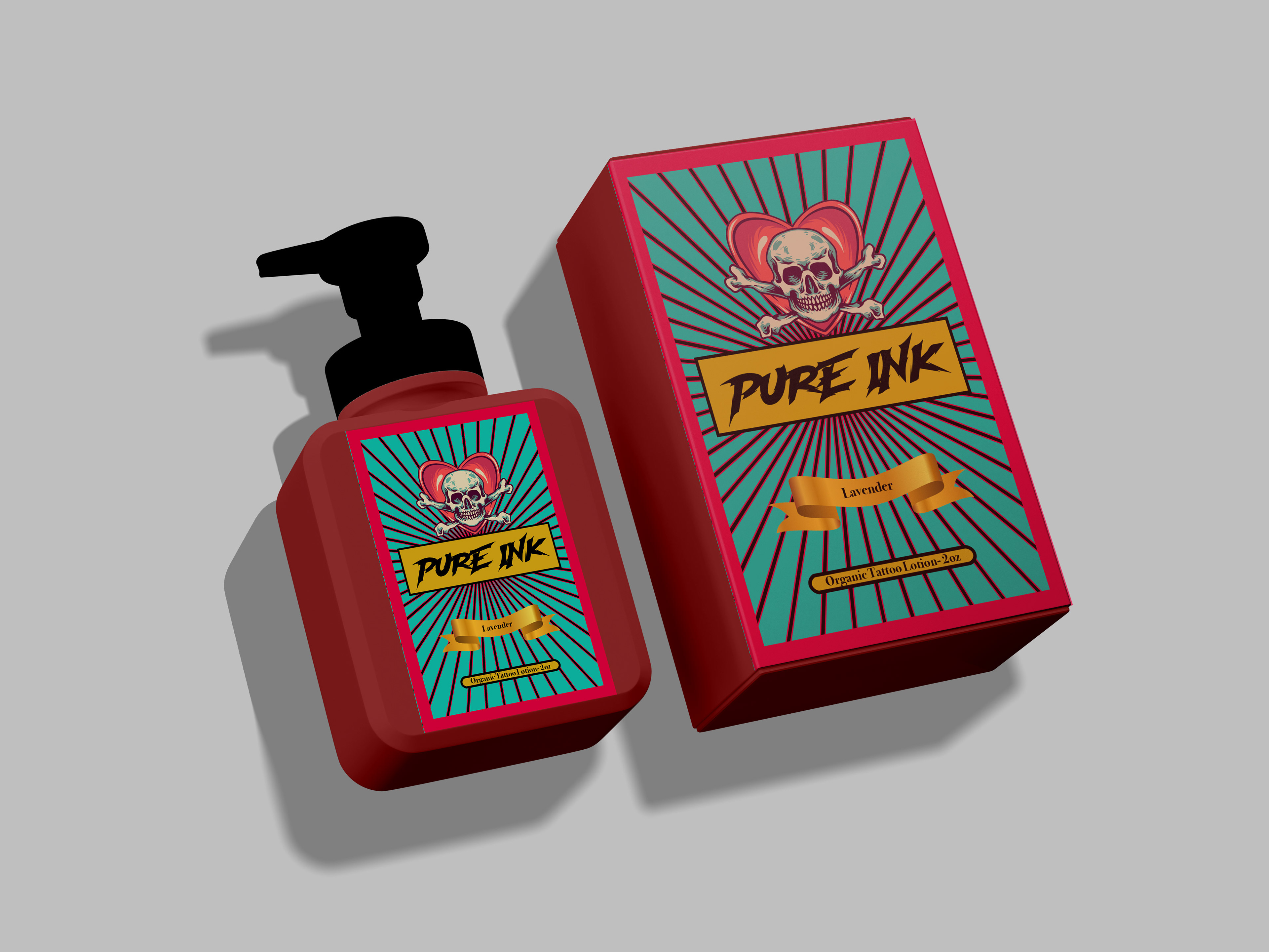
Client: Pure Ink Tattoo Care
Project: Label & Box Packaging Design
Project: Label & Box Packaging Design
Overview:
Pure Ink Tattoo Care is launching a new tattoo aftercare lotion designed for individuals who value high-quality skincare and are mindful of the ingredients they use. The brand caters to a community of tattoo enthusiasts who prioritize both skin health and bold, expressive style.
Pure Ink Tattoo Care is launching a new tattoo aftercare lotion designed for individuals who value high-quality skincare and are mindful of the ingredients they use. The brand caters to a community of tattoo enthusiasts who prioritize both skin health and bold, expressive style.
Challenge:
The packaging needed to stand out on shelves while resonating with a creative and discerning audience. It was essential that the design feel bold, colorful, and fun—reflecting the personality of the tattoo culture—while still conveying a sense of trust and quality in the product.
The packaging needed to stand out on shelves while resonating with a creative and discerning audience. It was essential that the design feel bold, colorful, and fun—reflecting the personality of the tattoo culture—while still conveying a sense of trust and quality in the product.
Solution:
The final packaging features a vibrant design that combines a striking red with a soft teal green for high visual contrast. A distinctive skull motif adds an edgy, artistic touch that speaks directly to the tattoo community. The result is a playful yet impactful design that captures attention and aligns with Pure Ink’s brand identity.
The final packaging features a vibrant design that combines a striking red with a soft teal green for high visual contrast. A distinctive skull motif adds an edgy, artistic touch that speaks directly to the tattoo community. The result is a playful yet impactful design that captures attention and aligns with Pure Ink’s brand identity.
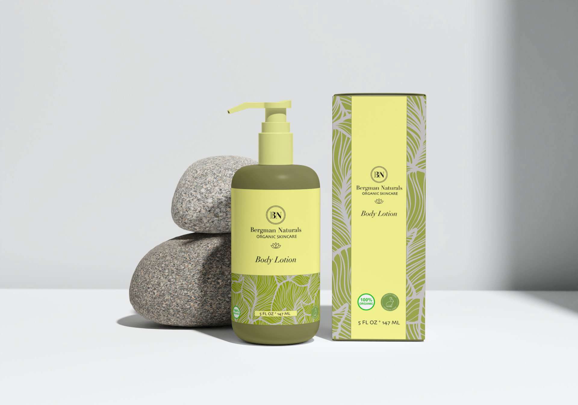
Client: Bergman Natural – Skincare Company
Project: Body Lotion Box & Label Packaging Design
Project: Body Lotion Box & Label Packaging Design
Overview:
Bergman Natural is a skincare brand focused on clean, health-conscious ingredients for both women and men. With a commitment to transparency and wellness, the brand needed packaging that would visually convey its natural roots while appealing to a modern, health-aware audience.
Bergman Natural is a skincare brand focused on clean, health-conscious ingredients for both women and men. With a commitment to transparency and wellness, the brand needed packaging that would visually convey its natural roots while appealing to a modern, health-aware audience.
Challenge:
The packaging had to reflect the purity of the ingredients and communicate a message of wellness and vitality. It was important to strike a balance between a gender-neutral design and a look that felt fresh, clean, and connected to nature.
The packaging had to reflect the purity of the ingredients and communicate a message of wellness and vitality. It was important to strike a balance between a gender-neutral design and a look that felt fresh, clean, and connected to nature.
Solution:
The final design features a harmonious color palette of green and yellow—green to represent nature and botanical ingredients, and yellow to evoke energy, warmth, and vitality. A subtle leaf pattern was incorporated to reinforce the product’s natural origin while maintaining a clean, minimalist aesthetic. The result is packaging that feels fresh, trustworthy, and aligned with Bergman Natural’s core values.
The final design features a harmonious color palette of green and yellow—green to represent nature and botanical ingredients, and yellow to evoke energy, warmth, and vitality. A subtle leaf pattern was incorporated to reinforce the product’s natural origin while maintaining a clean, minimalist aesthetic. The result is packaging that feels fresh, trustworthy, and aligned with Bergman Natural’s core values.
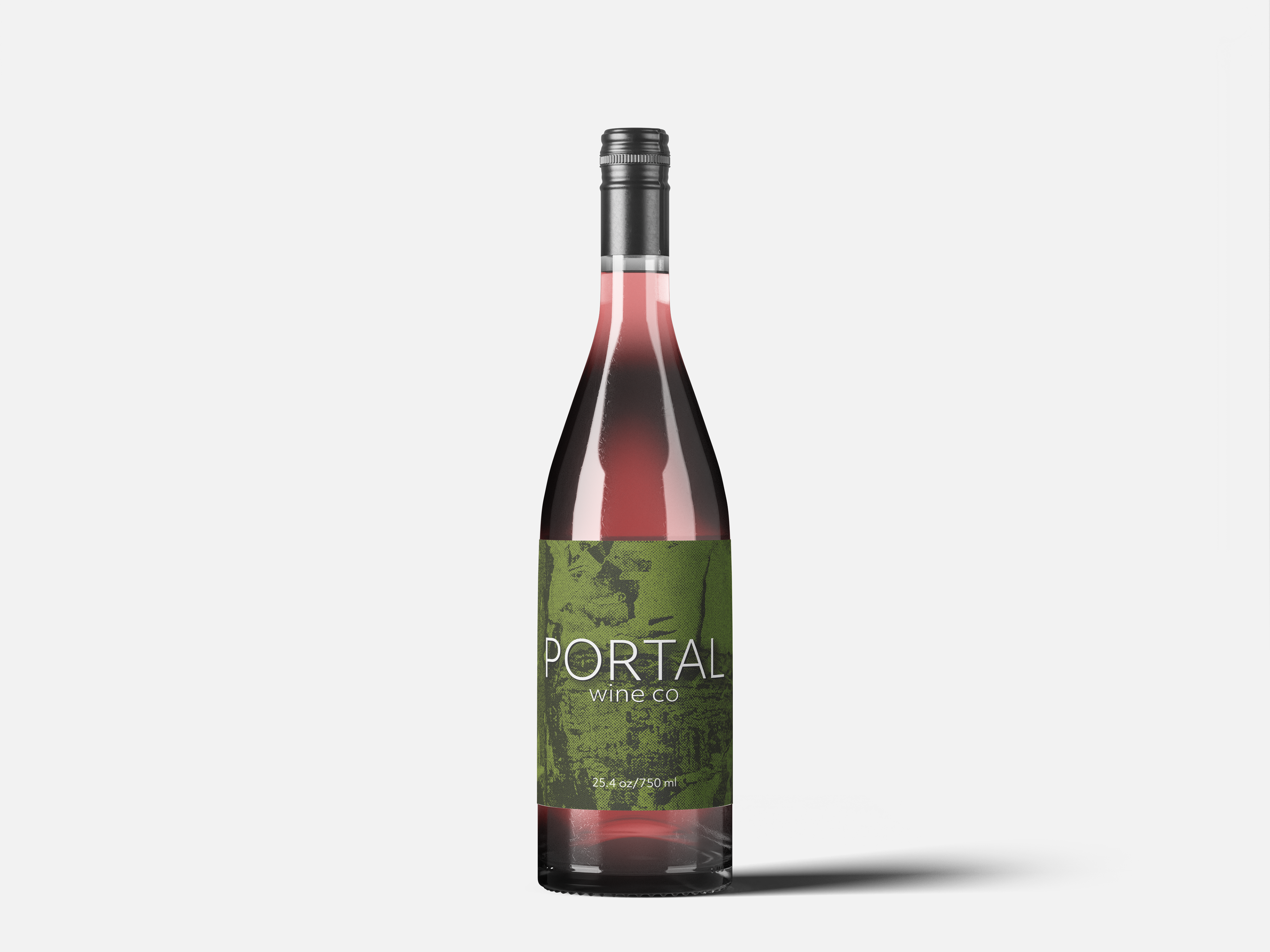
Client: Portal Wine Co
Project: White Wine Label Design
Project: White Wine Label Design
Overview:
Portal Wine Co produces white wines crafted using traditional old-world methods. For their latest vintage, they sought a label design that would reflect the artisanal quality of their winemaking while visually connecting to the natural ingredients and heritage techniques that define their brand.
Portal Wine Co produces white wines crafted using traditional old-world methods. For their latest vintage, they sought a label design that would reflect the artisanal quality of their winemaking while visually connecting to the natural ingredients and heritage techniques that define their brand.
Challenge:
The label needed to highlight the color green—symbolizing both the natural environment and the green grapes used in the wine’s production. Additionally, the design had to appeal to wine enthusiasts who value craftsmanship, tradition, and authenticity.
The label needed to highlight the color green—symbolizing both the natural environment and the green grapes used in the wine’s production. Additionally, the design had to appeal to wine enthusiasts who value craftsmanship, tradition, and authenticity.
Solution:
The final design prominently features a green color palette to emphasize the wine’s natural origins. A rustic, aged texture was incorporated to evoke a sense of history and old-world charm. The result is a label that feels both grounded and refined—perfectly aligning with Portal Wine Co’s identity and appealing to their tradition-minded audience.
The final design prominently features a green color palette to emphasize the wine’s natural origins. A rustic, aged texture was incorporated to evoke a sense of history and old-world charm. The result is a label that feels both grounded and refined—perfectly aligning with Portal Wine Co’s identity and appealing to their tradition-minded audience.